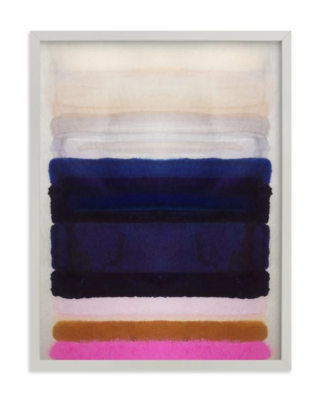
Sophisticated Yet Casual Living Room
Working with couples is always funny, because 9 times out of 10, you're really just working with one person and the other one is just along for the ride.
This couple had just relocated and wanted to upgrade their living room area. Although they weren't super particular about their style, they did note that they wanted this space to feel "grown up" and sophisticated, without being to "stuffy" because this is where they'd be watching television, hosting friends, and just plain ol' hanging out. One of them did have one very specific request:
“Since I live with my boyfriend, I’d the room to compliment his tastes as well. A mixture of items that are fun but don’t scream “girly” or overly feminine.”
Well that I could totally relate with.
Although I never considered myself to be someone who had super feminine tastes, after living alone for so long, when my husband and I first started living together, I wanted to make sure he didn't feel out of place.
I took a look at their inspiration photos and that gave me a general idea of the direction we'd be going in. Using a soft grey as the primary color, I created a design that was modern & serene, to suit their aesthetic & functional needs. The soft tones were balanced with textured & metal accents for a look that would appeal to both of them.
I'm going to let you in on a little secret...
When I put together my mood boards, they're really just to nail down the overall design concept. There's never anything concrete in place at this time, but instead we're taking the ideas and trying to visualize them in a more compact way -- color palette, design style, featured items, etc.
For this reason, I don't source pieces for the mood boards; it's typically a compilation of images from Pinterest and vendor sites.
HOWEVER, experience has taught me that sometimes clients have a difficult time viewing this initial board as just inspiration; and what ends up happening is that they fall in love with the ONE thing on the board that I pulled out of internet thin air, that turns out to have been a commissioned custom piece made by a now deceased artist.
Yes, I am being dramatic, but it happens. So I've learned to only put together boards that I can realistically recreate, and that if necessary, I can locate the items (or their replicas) on the board.
I say ALL that to say that when the client came back to me with their feedback, the first thing they did was call out the pieces that they wanted... from the board... as is.
Challenge accepted!
I didn't see this as a problem, as it told me that we were at least on the same page. The only significant change we made was to introduce more vibrant colors through the pillows and rug.
Because of the space's configuration, I wanted to make sure we nailed down the space plan.
Using the measurements they gave me (super detailed) I put together 2 options to understand how they'd be moving around the space and to make sure I'd source items that would literally fit.
One option was pretty "safe" in terms of layout.
The second was a little more unexpected (whenever I'm giving options of any kind I always try to mix it up in this way to really get into the client's head).
We decided on a space plan that landed somewhere in between the two, and starting refining the design.
Being that I was able to identify everything on the board that they loved, sourcing for this project relatively easy, except with one major hiccup: from the very beginning, she made it very clear that her boyfriend LOVED the chair on the concept board & they had to have it!
Finding the chair was no problem; the problem is that it would eat up a substantial part of the budget, especially since we were getting 2!
Despite showing them more budget friendly options, they weren't budging and were even willing to cut back on other items so that we could make it happen!
We continued to work through the design with the remainder of the budget, and thankfully the other marquee pieces had also already been chosen. We also agreed that we wouldn't get BOTH chairs at once.
Lastly, after deciding between two rug choices, our design was finally complete!
Admittedly, I was surprised at how everything had ultimately turned it; not because it was a difficult design or anything like that, but because of where we started, based on the brief & the resulting mood board -- soft, neutral, and textured -- only to get here, a design still full of texture, but far more vibrant.
Sometimes, clients don't know what they want -- this we know. But more often than not, they actually do know what they want, but they struggle with putting it into words.
We're conditioned to covet all these things, but by taking it all in, it messes with our subconscious & makes it difficult to discern what we'd like to look at from what we'd like to live with.
My place in the process to get that discernment going & bring our your true dreamscape.
Mission accomplished ✨


