Spring Styling: Dining Room & Bar Decor Refresh
It's officially Spring & I am totes in the spirit of the season!
As you know, our condo has a very warm aesthetic -- the primary living areas are a deep beige tone -- which is the complete opposite of my husband & I's aesthetic. Since we prefer cool, light, bright, and airy, I rely HEAVILY on decor styling to balance out the overall warm tone of the space.
What's awesome about the dining room is that it's the highest peak of the ceiling & who doesn't love a vaulted ceiling?! This definitely helps in that area feeling a lot more open. I decided to introduce into the space lighter tones in the tablescaping & surrounding decor, as well as incorporating more natural accents to create a Hygge inspired springtime look.
Anchoring the entire look was really the dinnerware! I used the Court Dinnerware Collection from Crate & Barrel, a gift from my husband when we were first dating, and these bright & crisp pieces immediately transformed the space. As I layered in other tablescape elements, such as the linen placemats, dotted napkins, glass mugs, and pink & silver flatware, the whole dining landscape began to transform into something that was super springy.
While I continue to edit & style the dining table, I knew I wasn't going to be completely satisfied until I started to transform the space holistically, and that meant moving on to the barscaping!
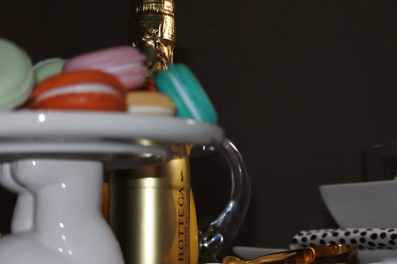
The bar featured a lot "heavy" pieces -- visually & literally -- and so for me, I knew opening it up & lightening it up would make all the difference. Swapping out the blue decorative spheres for the same set but in a complimentary white was key in seeing a real transformation in this area.
Next, was just a lot of trial & error truthfully, playing around with all the new decor I'd recently purchased, editing, styling, and just seeing what felt the best. I knew I wanted it to not only feel more Hygge, but also to truly start to be more bar-esque, especially for the Spring season. I wanted to feel inspired to make Spring cocktails & mocktails!
Once I was done playing around with the bar, completely editing out the blue tones and introducing more neutrals, the final touches came in with the perimeter of the dining room!
We swapped out our artwork -- literally swapped it out for the one that was in the hallway -- and OMG! This made a HUGE difference is lightening up the walls. The white & rose gold piece made threading the blush pink into the space so much easier and more natural feeling.
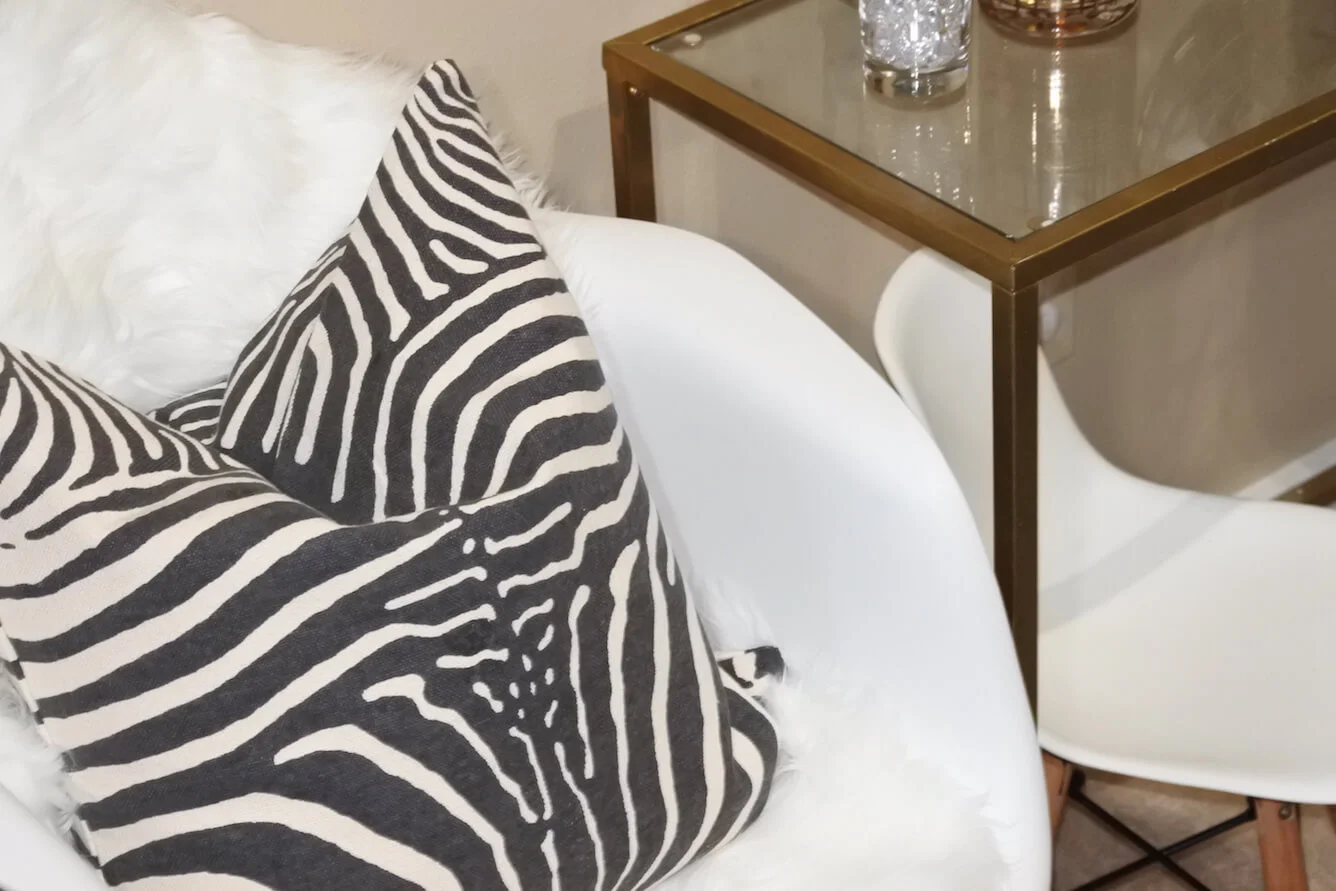
By bringing in the blush pink fringe, white faux fur, and zebra print cushion covers I not only brought in pops of color but also more textural elements making the space feel both glam & cozy.
PERF!
Some new faux sheepskin seat throws really added more texture & coziness to that area as well -- looking super fetch with the sebra print if I do say so myself.


