E-Design Shopping: Home Depot Finds
As a renter and as someone with a very renter-centric audience, I’ve noticed that some retailers end up becoming synonymous with home ownership and/or home improvement…retailers like The Home Depot. So I was pleasantly surprised when preparing for a new project I found that I was able to specify the ENTIRE redesign on The Home Depot site!
Typically, I try to use 3 to 5 sources for a project so that it’s a healthy mix of product without it becoming to overwhelming & dysfunctional. But the great thing about specifying from The Home Depot is that they’re not a product brand themselves, so much as they’re a place to find hundreds of brands, still allowing me to create that collected look.
I was most impressed by the assortment of furnishings and decor because of the nature of the project — a studio apartment re-design, so everything needs to be renter-friendly and reversible, while also meeting the aesthetic & functional needs of my client.
After combing through everything — a lot more than I expected — I found myself hoarding a few pieces that may not have been a right fit for the project, but still dope & maybe perfect for a future project.
If you’re like me, and you’ve never considered The Home Depot for your design project — whether it’s a a full do over or some quick styling updates — I’m gonna share with you some of my recent favs from the Home Depot site that are stylish, chic, and perfect for any space.
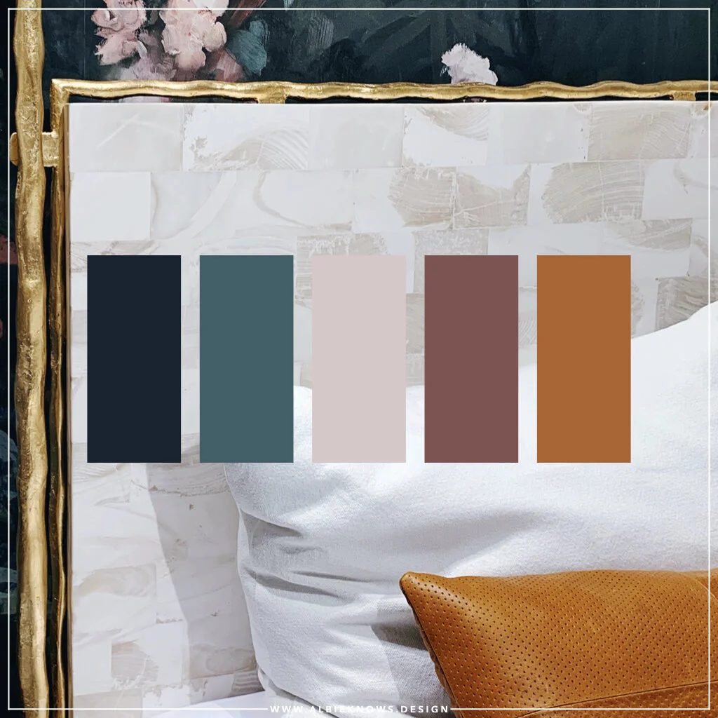
The aesthetic for the design is feminine, cozy, functional, and minimal — so soft neutral colors, lots of texture — y’all know none of my designs are complete without a bit of Hygge inspired elements — and clean, unobstructed lines, keeping in my this is a studio apartment in Brooklyn, NY that’s less than 500 sq. ft.
While browsing The Home Depot site, I honestly had no clue where to start & therefore even less of a clue of what to expect. Because I was able to search by room & by style, I used those as my starting point.
One of the very first pieces I found was this stunning velvet upholstered arm chair with gold steel legs — Amaya Light Beige and Gold Fabric Lounge Chair. I knew that no matter where the rest of the design took me, that this was going to be part of the design because it encompassed everything we wanted to create.
Vignette 1
Vignette 2
Vignette 3
The fact that I was able to create so many different combinations for the space as a snapshot for my client was really a treat — I’m always cooking up different designs before landing on the perfect pick to present to the client, but it typically involves multiple retailers coming together to create the look I’m going for.
I was able to specify for the entire project — living area, sleep area, kitchen, bathroom, entryway… alladat! — on one site & it was sooo refreshing.
We’re still working on the project, but I am already excited to see how it unfolds when the time comes.
I’ve never thought to turn to The Home Depot for anything more than home improvement tools but I think now I’m going to have to rethink how I see em!


