One Room Challenge Week 5: When E-Design Meets Full-Service Interior Design & Organization
“This post is in partnership with companies I love & know you’ll love too!”
Holy Moly Canoli…One week to go!!! And OMG!!! Before we get into the nitty gritty of #allthethings can we talk about some of the epic moments of this project:
I did the actual installation for the design...not the client, as with a typical e-design project
This project got me back to NYC for the first time in 31 months (yes I counted!) since moving to Washington state
In 48 hours we installed, styled, and shot the space (shout out to my design bestie & her photographer!)
Thanks to my east coast visit, I got to finally meet my virtual design bestie in real life
Not only was I the designer for the project, I was doing all kinds of KonMari’ing in the space
What a couple of days it was! So let’s get into it!
As you know there were a lot of objectives in the agenda for this transformation:
maximize storage options
optimize for better flow & function
inject with style & swag
This lent itself to being a pretty long laundry list of to do’s, and some plans had to get chopped and screwed.
It was a perfect reminder that some progress is better than no progress — the magic is in the editing, not in the perfection.
The beauty of e-design is that it doesn’t have to stop here — I can consult with her on the next phase of what she’s ready to tackle, whenever she’s ready, with a quick video conference. But with the bulk of the transformation completed by yours truly, the space already feels less overwhelming and daunting. She can now start to feel confident in her home and be at peace knowing that her stuff isn’t working against — it’s working for her.
It’s Design Therapy!
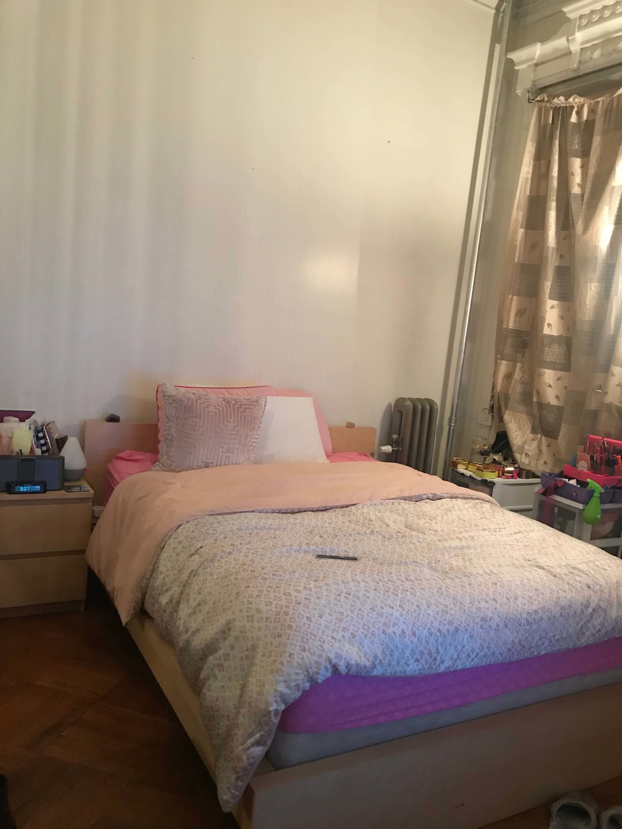
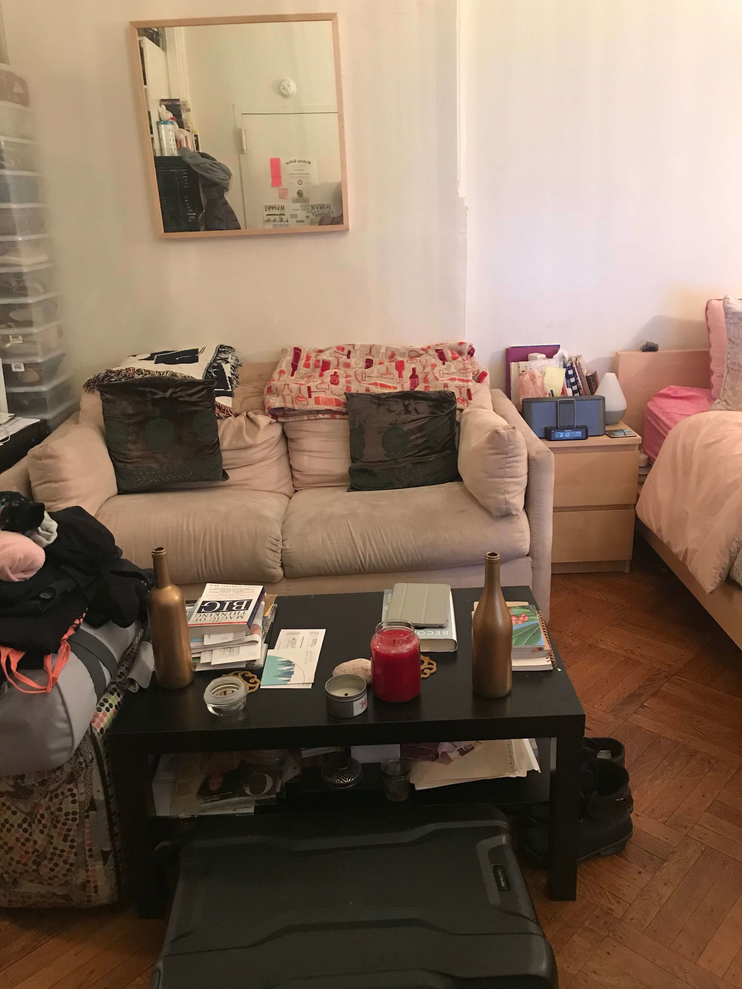
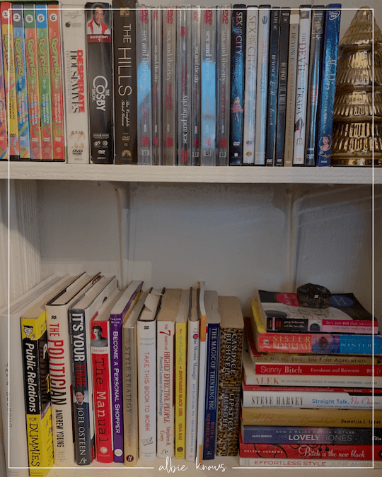
Once physically in the space I knew exactly what I needed to tackle — I took off my designer hat, and got straight to getting my KonMari on. Fun Fact: I few years back I almost got certified in the KonMari method, but the timing & pricing just weren’t in alignment. I decluttered the hell outta that place! Lemme tell ya! And because, unlike her, I had no emotional/sentimental attachment to anything, I had no qualms about dumping things and/or putting them in storage to be sent off with Simplify Storage. This meant seriously tackling the closet, bookcase, desk, and vanity area.
Freeing up these areas was immediately transformative!
My design bestie and I got right into making things pretty —
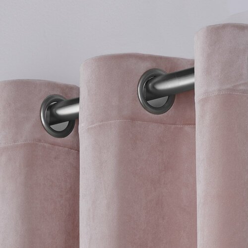
putting up new 9 foot blush pink velvet drapery
hanging new chic & “swagu” artwork and relocating her existing art
organizing the desk for day to day usage
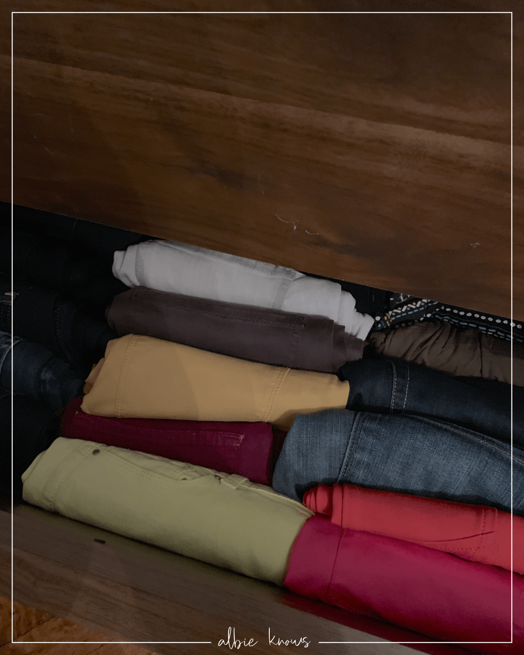
color coding the closet (big fun by the way!) with new matching velvet hangers
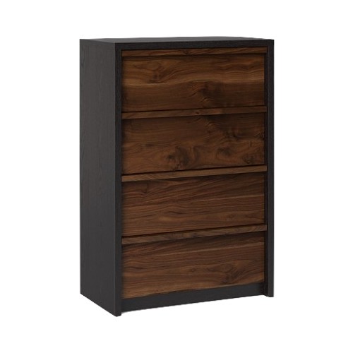
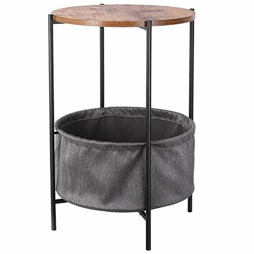
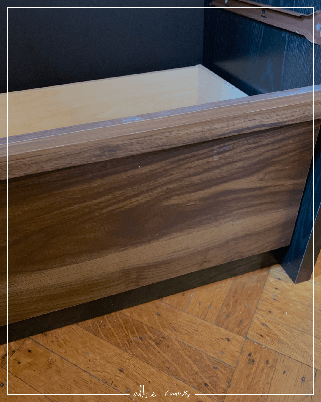
assembling the new two-toned dresser & storage side table
Quick Shop
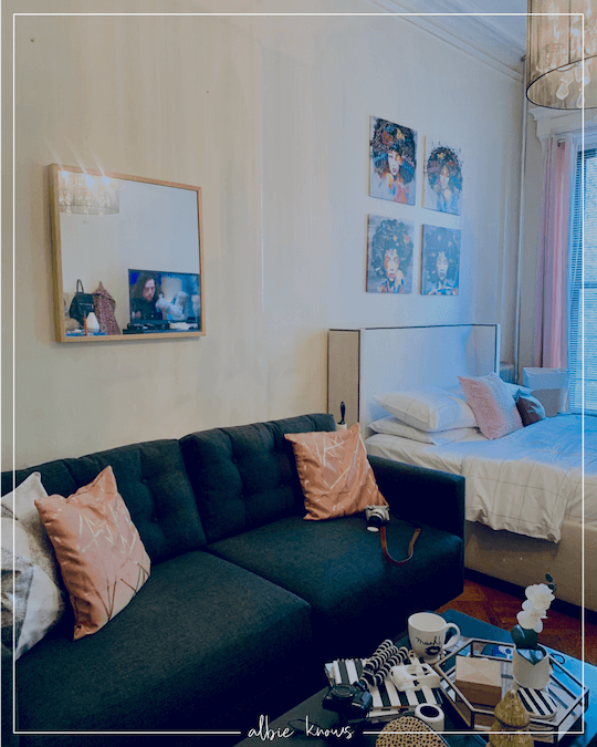
The new drapes were an instant facelift — because we didn’t paint, I wanted to break up all those white walls while also still highlighting the amazing details of the apartment’s molding. The heavy velvet adds a luxe touch while the blackout feature makes it super functional!
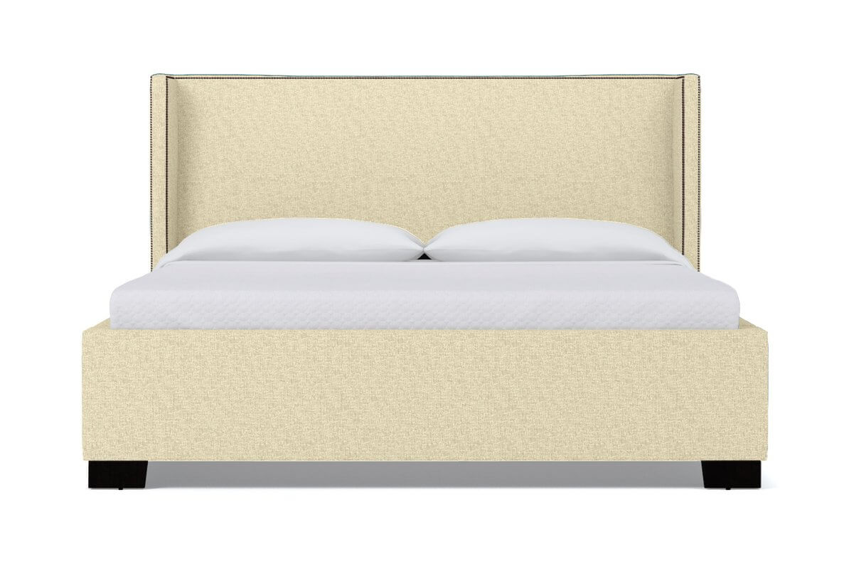
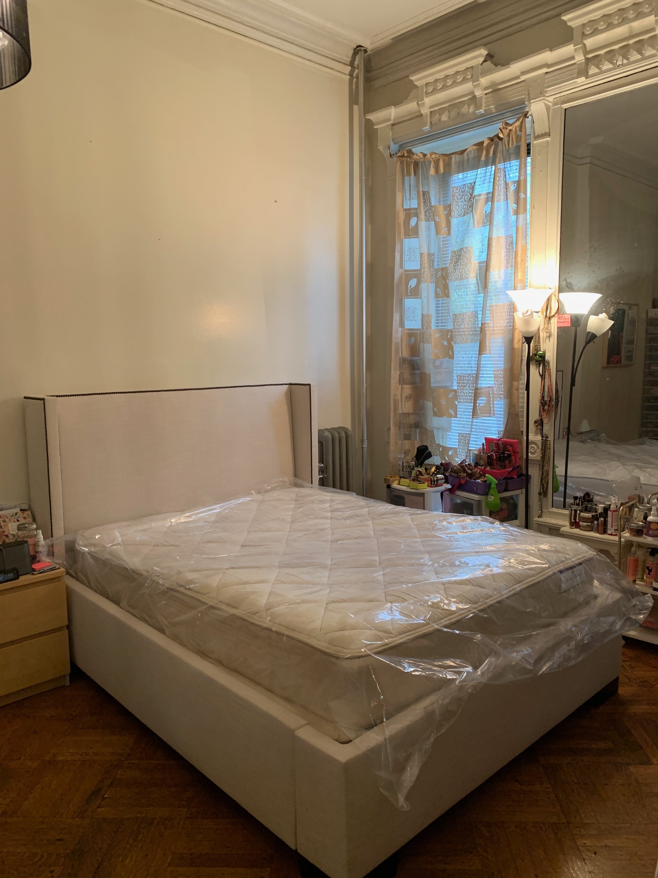
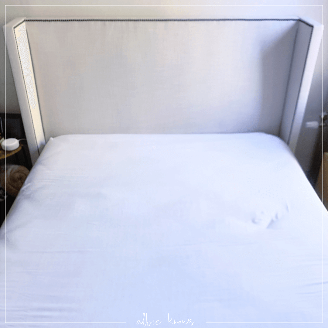
Even though I wanted to use the vertical space for storage, that’s not something we were able to tackle this round. So what does one do with bare white walls that are 9’ high? You get some dope AF art work is what! “Centering” (I use quotes because, without a rug, the bed slides side to side making its center pretty hard to find) the art quartet above the bed draws the eye up and creates a defining focal point for the sleep area...although, to be quite honest, the bed is quite the looker with its linen upholstery and antique bronze nail heads.
So stunning and timeless! Aka super grown-up.
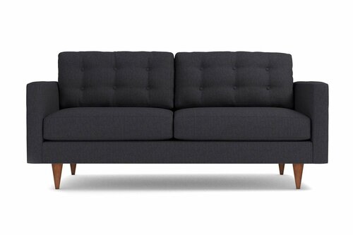
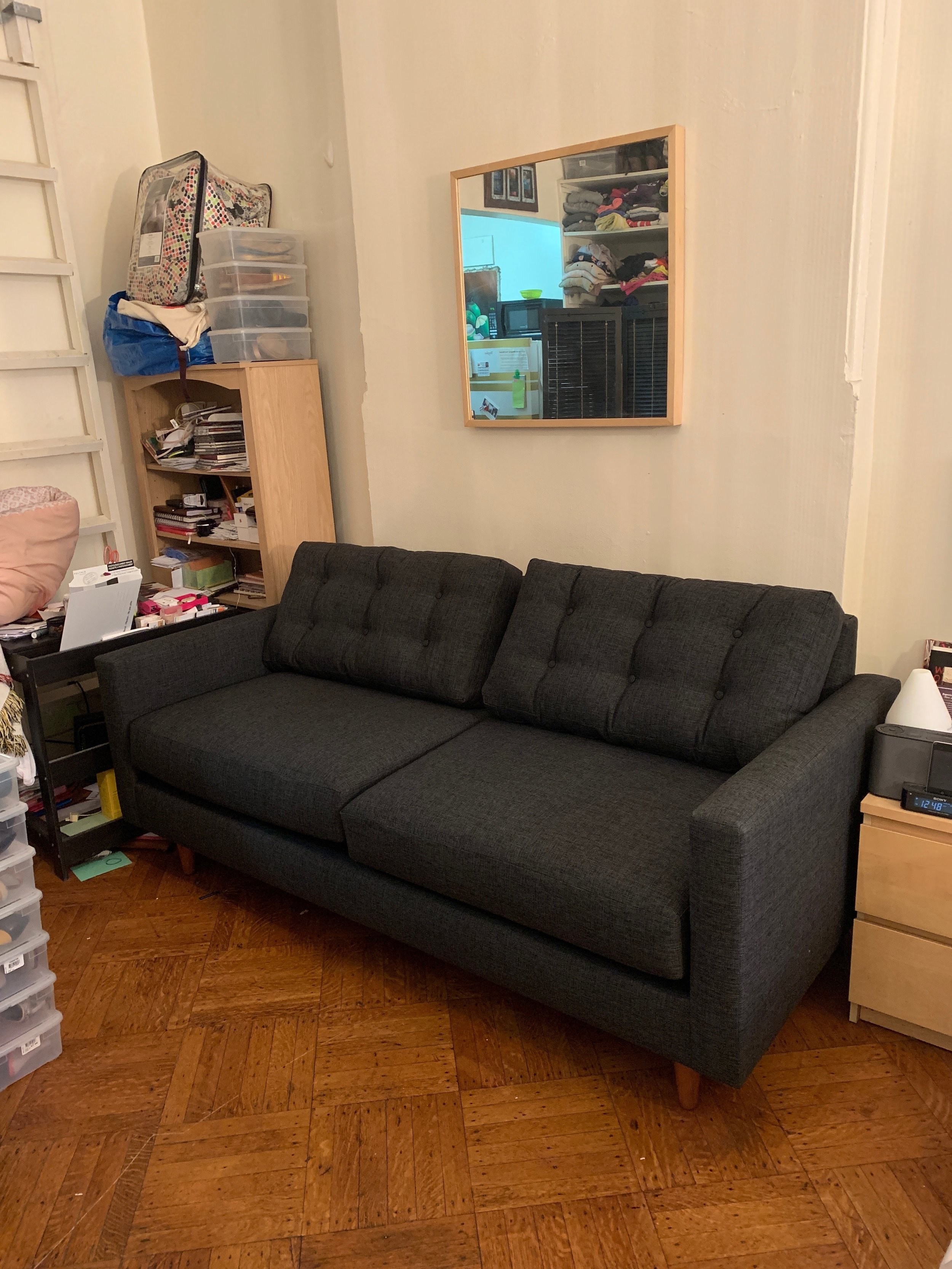
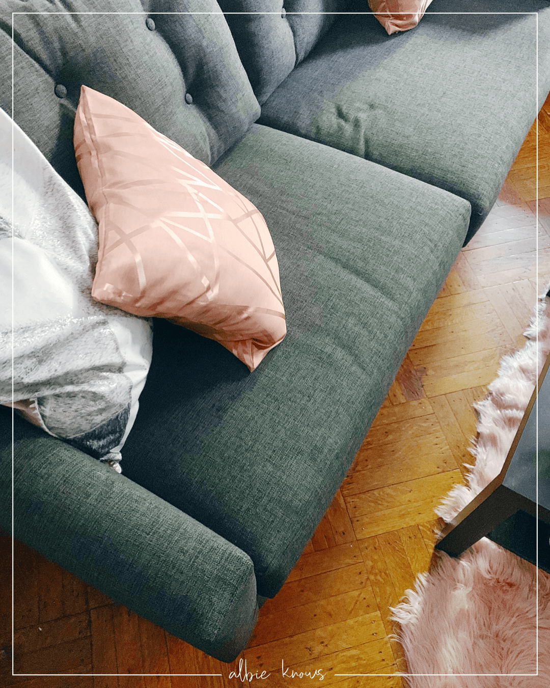
Relocating an exiting canvas piece she had to a wall at the other end of the studio (versus facing the bed) really helped with delineating the different zones on the apartment. These types of open spaces — with walls that concave in and out — are a great excuse to create accent walls with removable wallpaper, a statement mirror, or other temporary wall solutions. Moving her existing desk into a nook in the apartment where a bookshelf used to be allowed each area to be clearly defined, with the sofa from Apt2B being taking centerstage. Now there’s a dedicated area to pay bills, write, and get work done from home, distraction free.
Right across from that area brings us to the only existing closet in the apartment and so to really make the best of a tight space, it was all about visually clearing it out — color arranging the wardrobe and using uniform hangers make a HUGE difference in a small space and is such a simple way to use your own pieces to make your home look & feel better. With a new chest of drawers, the shelves were freed up a bit more for bedding, bags, and footwear.
And let’s talk about the chest — thank you Target Project 62! While assembling furniture is never fun, it was totally worth it for this two-tone wood chest. The black surround and deep wood drawer faces perfectly complimented the charcoal grey sofa and its pecan legs; while also contrasting the softer upholstery of the bed.
The combination of light and dark throughout the studio really gives the illusion of more space than there actually is.
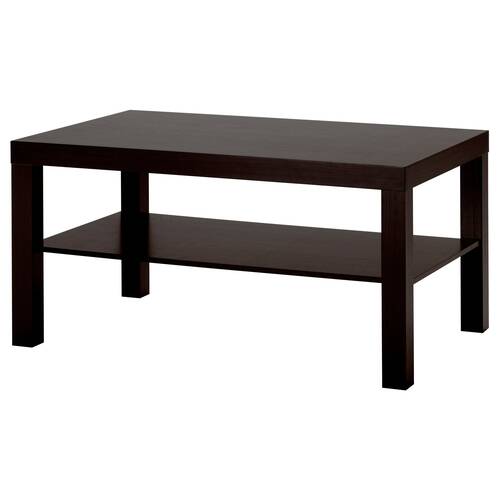
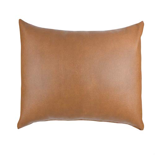
This also allowed the brighter, more vibrant colors threaded throughout to really stand out & pop — from the pink faux fur runner underneath the cocktail table to the cognac leather lumbar pillow on the bed. Piece by piece seeing the studio transform make my heart sing and with one more week remaining, I can’t wait to see the culmination of this cross-country collaboration!

